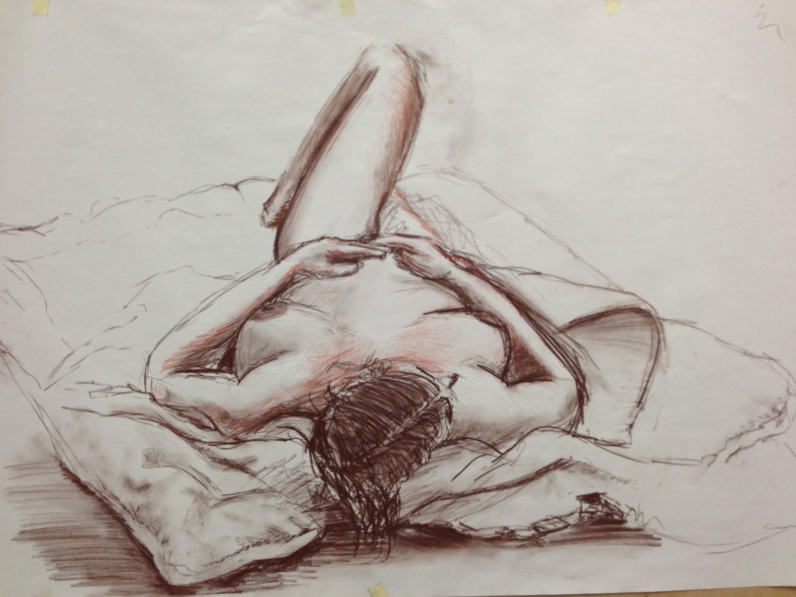
Tuesday 26 February 2013

Rock Man

This weeks task to was draw a rock man (similar to the lava character).

I tried to concentrate on edges and composition of this one. I was very close, but after reviewing the progress I had made, I feel to draw it how I would like it to be, it would need to be drawn again to fix some crucial errors. I need to fix the form of the leg, and also show light reflection on the character a bit more.

Here are my sketches to get some ideas down:


This is my final outcome:


And here's how I got there:


Tuesday 19 February 2013

Useful Critique

After producing my early piece of work today on painting Lava, I decided to seek some critique. So I turned to a very good friend of my, Junior Artist at Atomhawk Design, Connor Adams. I first met Connor on the Train2Game course both on the 3D Artist and Animator course.

Connor's work has increasingly grown stronger over the period I have known him, and he continues to help me with my studies providing me with great tips and tricks, with reference to artists and books that'll help me.
His portfolio can be found over at his FACEBOOK page. I'm sure you won't be dissapointed.

Any way, moving on to the purpose of this post, Connor has provided me with some great tips; this time round on contrast.

In his words, "[...]don't forget that contrast comes in more forms then just value. So there's colour, edges and composition to consider as well". Straight away he made me realise that the only thing I had thought about in my piece, was the values!


The conversation then developed more specifically into edge control, as this was one topic I hadn't ever thought about. My immediate thought was that he meant how sharp my edges were. But with the first artist example he showed me that changed.

He began by talking about the shapes, angles, and whether or not the edge is soft or sharp; all these help throw your eyes around the canvas. The example he used to explain this was that of Rick Berry's which I have included below.


Notice how the sharp angles on the face immediately draw your attention. whilst the shoulders and back of the neck are softer, blurred, gentle edges. You don't really look at them until very last.

The conversation then further developed with another example, into how saturation and and how how 'tight' the edges are, also help to compose your image.

The Halo image found on CG HUB was the talking point on this topic. Connor discussed how the helmet has very tight edges with strong contrast against it's background. This compared with the legs which have very soft edges, and occasionally blend with the background.

It is important to consider your background, as you can see it can make a massive difference! I believe with my drawing, I should have maybe made it more dull, or include a full scene behind where I could use lighting to help make parts of my character to stand out.

The final point to make on this character is how the only Saturated colour is that on his helmet. Again, comparing this with my drawing; which has saturated points all over the place, shows a strong area of improvement.

Any way, I hope this report helps you (the reader) with any future paintings you may be thinking of doing yourself! I cannot express how much anyone that reads this post should visit the links within, especially that of Connor Adam's.

Thank-you for reading.


Lava

Painting lava was actually very difficult. The main problem I encountered was to make lava glow more, the surroundings have to be darker. However, as the surroundings went darker, detail and form was harder to achieve.

Nonetheless I'm very pleased with my outcome. :)


Monday 18 February 2013

Painting with brushes (digitally)

This week's lesson was about painting with brushes, using the Alt key to colour pick and blend.

I already paint like this.

I just can't paint.

Anatomy


Reference:


Final:


Life Drawing - Female

This week we had the female model again.

We did some experimenting with ink, however I really didn't get on with it as I couldn't achieve much tonal value with it.

I wasn't that happy with most of the drawings I produced until the last one, which had a great angle, and really showed foreshortening. The only real mistake that I did do was make the inside of the calf too dark. Although it looked darker, tonally, it had the same level of light as the inside of her left thigh.


Saturday 16 February 2013

Robot Paintover

Just like last week except with a robot instead:


FINAL

Life Drawing Poses and Self Portrait

On the lesson which I produced these on, we had to draw a pose we had in mind, then get someone to model that pose to see how close we were.

It was a great exercise because it got us to self-critise our own work as well as learn how to correct it.

We then went onto self portraits. My first was not bad head, mouth, nose, but the eyes were awful.

My second was much better.

Just a quick note; I produced these BEFORE the head studies I posted prior to this post. :)


Monday 11 February 2013

Head Studies 1 & 2

Today I started to work through one of my Christmas presents - "Drawing the Head & Hands" by Andrew Loomis.

I cannot stress how useful this book has been in just the first few pages and I am truly excited to work through the book studying this area if anatomy.

Without saying more, here are 2 studies I have already produced:


Tuesday 5 February 2013

Lego

Well if that title doesn't boost my blog views, nothing will.

So this weeks task was to do a paint over. This is basically the concept of painting over a model in Photoshop, so your models lighting is already defined, you just have to add texture and colour.

The theme was Turrets so I got started by creating a mood board, followed by doing some quick sketches for some ideas.


As you can see, my drawings weren't too successful this time. So I turned to LEGO!


I then put this into Photoshop and started to draw the important shapes.


After this concept was drawn I had enough information to begin modelling in Maya.


 Now I had my final model I just had to render it before starting my paint over.


Here are my paint over stages:


My Final Image


 I was quite happy with my final outcome, I think to improve it I would have to do a new render. I think I need to apply materials to the floor and backdrop so that I can create a better environment for the turret to sit in.

However, having said that this concentrates detail on the model instead of deterring the viewer into the background.